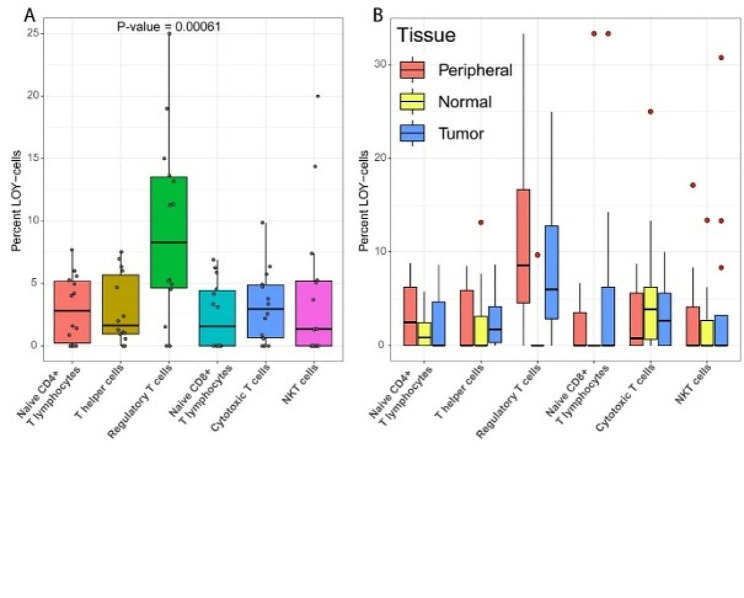
Fig. 1.
(A) Boxplot showing the overall percentage of LOY in different T lymphocyte subsets, in each studied subject of the public datasets. Each dot corresponds to the LOY frequency of one patient, color-coded for each cell type. (B) Similar boxplot as in A, stratified by tissue of origin for T lymphocytes as indicated. Peripheral, Normal and Tumour indicates peripheral blood, normal tissue adjacent to tumour and tumour tissue, respectively. Note that the dots here marks outliers, and has therefore been coloured red to differentiate them from the dots in A

