Figure 1.
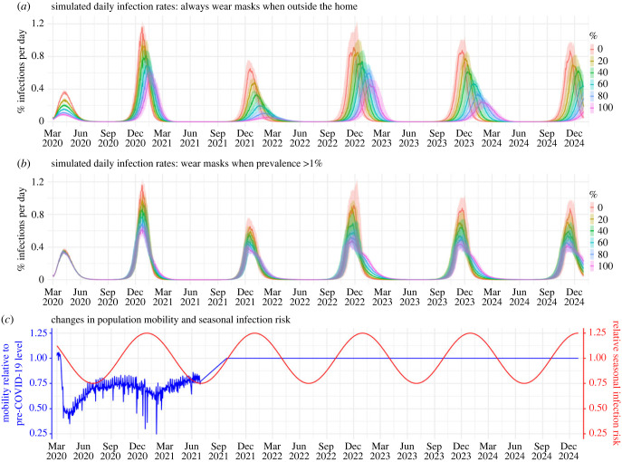
Example simulated epidemic infection rates. For these simulations, the model assumes an R0 of 2.6 and no mask wearing at home. Coloured lines (median) and shaded areas (interquartile ranges) show daily infection rates for simulated populations with different masking rates (see legend) and timing of masking: (a) mask wearers do so outside the home at all times or (b) only when infection prevalence is greater than 1%. For context, (c) shows changes in daily population mobility (representing reductions in contact rate due to social distancing rules) and seasonal infection risk (representing effects due to environmental conditions), used in the simulations. Mobility data for New York City during March 2020–June 2021 (shown here) were used directly as model inputs. From July 2021 onward, we assumed there was no social distancing and increased the mobility linearly to the pre-COVID level over a three-month period and then remained at that level (i.e. set to 1). Trends in seasonal infection risk were represented using a sinusoidal function (see details in Methods).

