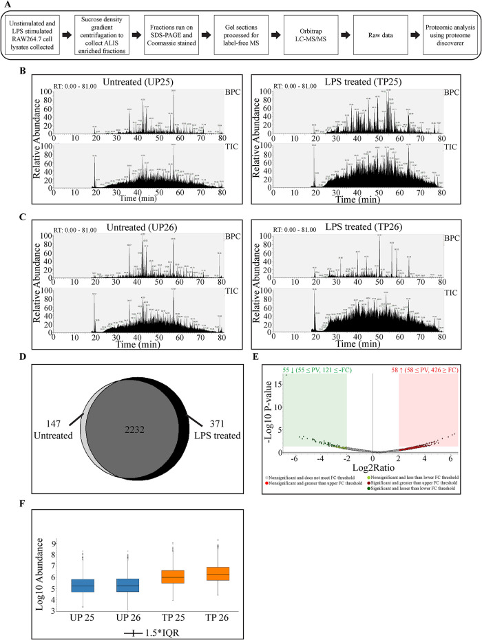
FIGURE 6:
Bioinformatics analysis of MS data: Schematic to summarize sample preparation for mass spectrometry and data analysis (A). TIC and BPC showing comparison between LPS treated and untreated fractions 25 (B) and 26 (C). Venn diagram showing the distribution of proteins identified in unstimulated cell lysate fractions versus LPS stimulated cell lysate fractions (D). Volcano plot representing the fold change and p value in the proteins identified from LPS and control treatment groups, where x-axis shows fold change and y-axis depicts p value (E). Sample abundance graph indicating the peak intensity values. The second and third quartiles for the data set are represented as rectangles in the graph (IQR = Interquartile Range) (F).

