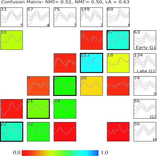
Figure 1.
Comparing two clustering results using a confusion array. Shown in this comparison is a supervised clustering result published in the original study by Cho et al. (1) and results from running an unsupervised clustering (EM MoDG, see Methods) on the same Affymetrix microarray dataset profiling yeast gene expression through two cell cycles. The confusion array is composed of a grid of summary plots. Each summary plot displays the mean (blue color or solid line) expression level of a group of genes as well as the standard deviation (red color or dashed line). Summary plots with a white background represent clusters from either the Cho et al. (1) clustering result (along the right most column) or the EM MoDG clustering result (along the top row); cluster names are in the lower right corner; and the number of genes in each cluster is displayed in the upper left corner. Summary plots with a colored background represent cells within the confusion array (see Methods), where each cell represents the intersection set of genes that are in common between the Cho et al. (1) cluster and the EM MoDG result cluster. Again, the upper left hand corner displays the number of genes within a confusion matrix cell. The background of each plot is colored according to a heat-map (scale below) that registers the proportionate number of genes in the cell compared with the corresponding cluster in the EM MoDG result. Intersection cells with dark outlines indicate the optimal pairings between the two data partitions, as determined from the LA calculation (Equation 2). Quantitative measures of overall similarity between the two clustering results using both LA and NMI are displayed in the graph title (see Methods).

