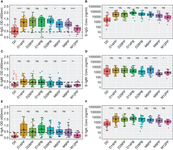
Figure 3.
Comparative Analysis of Spike-Directed Antibody Responses: Boxplot Representation Across Different Time Points. This figure shows the distribution of antibody responses over time using boxplots, highlighting the median (lines), mean (black circles), and quartiles for IgG (A, B), IgM (C, D) and IgA (E, F). Significant differences between adjacent time points were assessed using an unpaired Wilcoxon test with a Bonferroni correction for multiple testing. Notation ns denotes p-values > 0.05 and was considered insignificant. *p ≤ 0.05, **p < 0.01, and ****p < 0.0001, indicating increasing levels of statistical significance.

