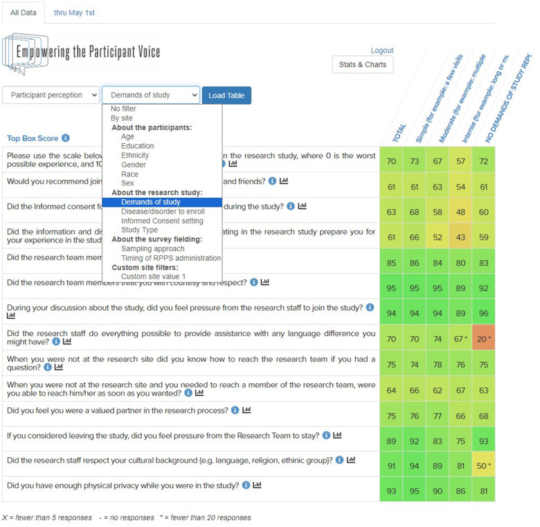
Figure 1.
At-a-Glance Dashboard features – visual analytics and filters for RPPS data. Dropdown menus display choices among the survey perception questions (shown) or response and completion rates. The middle menu filters the survey results (e.g., age, sex, race, etc.). Blue “i” icons display definitions and scoring information. Response data are displayed as Top Box scores with conditional formatting from high (green) to low (red) scores. The “Total” column contains aggregate scores; filtered results populate the columns to the right.

