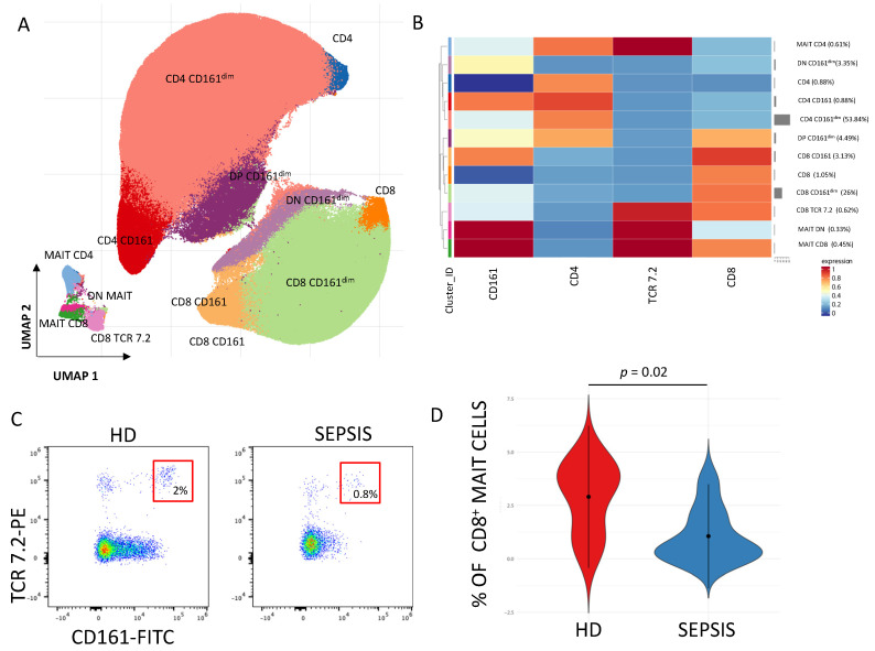
Figure 5.
Quantification and phenotypic characterization of MAIT cells in septic patients. (A) The UMAP plot illustrates the 2D spatial distribution of CD3+ T cells across 15 samples, integrated with FlowSOM-based clusters. The color of the different clusters is reported on the left side of the heatmap. (B) Heatmap of the median marker intensities of the 4 lineage markers across the 12 cell populations obtained with FlowSOM algorithm (meta-20). The colors of cluster_id column correspond to the colors used to label the UMAP plot clusters. The color in the heatmap is referred to the median of the arcsinh marker expression (0–1 scaled) calculated over cells from all the samples. Blue represents lower expression, while red represents higher expression. The light gray line along the rows (clusters) indicates the relative sizes of the clusters. DP = double positive; DN = double negative. (C) Representative dot plot showing the percentages of CD8+ MAIT cells (within CD3+ T cells) in healthy donors (HD) and septic patients (SEPSIS). (D) Violin plot representing the percentage of CD8+MAIT cells in healthy donors (HD) and septic patients (SEPSIS) at time of admission in Intensive Care. Non-parametric student t-test; exact p-value is shown in the figure. [data produced by the Laboratory of Immunology, directed by Prof. Andrea Cossarizza, University of Modena and Reggio Emilia].

