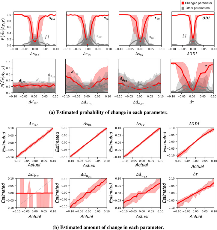
Fig. 9.
a) Each plot shows the estimated probabilities when the corresponding parameter on the has changed between two datasets. Red curves show the average posterior probability of change in the actually changed parameter versus the amount of change. The gray curves show the probability for other parameters. Shaded areas show the 10 to 90 percentile range. Larger absolute amount of change results in higher posterior probability for the true parameter change. Change in the signal fraction parameters and is distinguishable for effect sizes as small as 0.05. However, changes in diffusivity parameters even at very large effect sizes is cluttered with other parameters. b) Each plot shows the maximum a posteriori estimation of the amount of change vs the actual change in the parameter. The shaded areas show the 10 to 90 interval. The estimated change in the signal fractions follow the identity line (dashed gray line). The estimated change in is mostly around zero with a high variance as the posterior distribution is very flat and symmetric around zero. The change in and is systematically biased at higher effect sizes.

