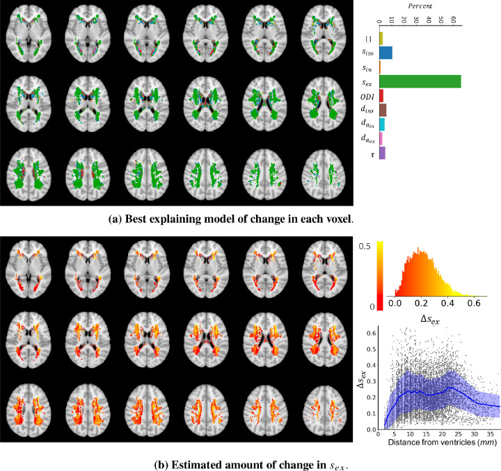
Fig. 12.
a) The colours indicate which model of change could best explain, i.e. had the highest posterior probability given the observed change in the summary measurements between WMH and NAWM. In the majority of voxels ( 65%) a change in explained the data better than any other model. However, in the regions very close to the ventricles there is no major winning model. This can be either because of high between subject variability or a different type of change that is not captured by the trained models of change. b) The maps show the estimated amount of change in in voxels where was the best model using a maximum a posteriori estimation ). At most of the voxels the estimated amount of change is positive, meaning that an increase in can explain the change in the summary measurements observed in the WMH voxels. The top right panel shows the distribution of estimated amount of change at the voxels where change in was the best model. Most of the estimated changes are between 0 and 0.4. The bottom right panel shows the amount of change vs the distance (in millimeters) from the ventricles.

