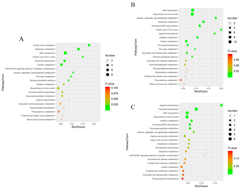
Figure 6.
Bubble charts of the top 20 among the cor, phl, and xyl groups. (A): cor-phl; (B): cor-xyl; (C): phl-xyl. The vertical axis represents the metabolic pathways, and the horizontal axis represents the enrichment factor. A larger Rich factor indicates greater enrichment. The color gradient from red to green indicates decreasing p-values; larger bubbles indicate a greater number of compounds enriched in the pathway.

