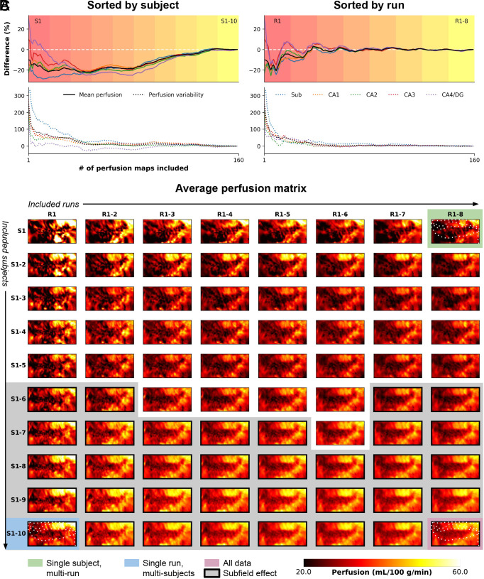
Fig. 2.
Evolution of high-resolution perfusion maps. The figure illustrates the progression of high-resolution perfusion maps, showcasing the percentage difference in mean perfusion (solid lines, Top) and variability (dotted lines, Bottom) across the entire hippocampus (in black) and individual subfields (color-coded). The evolution is presented as a function of (A) the number of included subjects or (B) runs. (C) Additionally, the figure depicts the unfolding of the average perfusion map and its evolution as a function of the number of included runs (rows) and subjects (columns) in consecutive order.

