FIGURE 3.

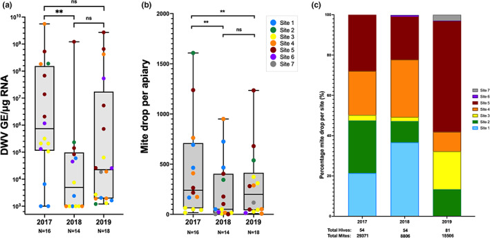
Pooled apiary DWV and individual colony mite drops and the change in proportion of mite drop between sites. (a) each point shows the quantified viral load for a single apiary on the island, the points are coloured by location and split per year of sampling. (b) Each point shows the average mite drop for an apiary at each of the seven sites in each of the 3 years of treatment. The n = X below each year indicates the number of apiaries analysed. The significance values shown at the top are p‐values determined using a Mann–Whitney non‐parametric test. (c) Year on year contribution of sites to the total Varroa drop across all sites after 1 week of Apivar treatment. Each coloured block represents the drop for all the apiaries in that site as a percentage of the total mite drop. Where sites are not shown it indicates no mites were recorded post‐treatment in those apiaries. The numbers below the x‐axis indicate the number of colonies treated and the total mite drop. Note that hive numbers differ from sample points in Figure 1b, as colony numbers changed between sample collection and treatment application.
