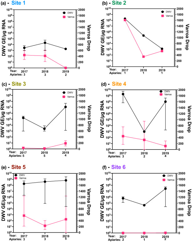
FIGURE 4.

Site by site DWV and mite drop averages across 3 years. (a–f) Viral loads for pooled samples of site 1–6 from 2017, 2018 and 2019 shown per site and the average mite drop shown per region. Each black dot represents the DWV titre from one apiary and the pink squares represent the average Varroa drop for the whole site. The number of apiaries at each time point are shown along the x‐axis. The error bars represent the average apiary range for each sample set. Site 7 is not shown as it only became an apiary and joined the study in late 2018.
