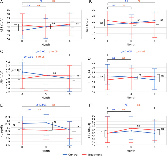
Fig. 3.
The graphs were drawn using the median and interquartile range values obtained from the SPSS analysis. The points in the graph show the median change over time in (A) AST, (B) ALT, (C) Alb, (D) PT%, (E) Hb, and (F) platelet count. Error bars indicate interquartile range. Blue dots indicate change in control group and red dots indicate change in treatment group. Changes over time were analyzed using the Wilcoxon signed-rank test, and significant differences for each group are indicated at the top of the graph. Comparisons between the treatment and control groups at baseline, 3 months, and 6 months were analyzed using the Mann–Whitney test, and significant differences for each group are shown within the graph.

