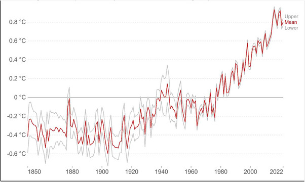
FIGURE 3.

The anomaly in the global average of land–sea temperature relative to the average of the period between 1961 and 1990. The red line depicts the average annual temperature trend over time, whereas the grey lines depict the upper and lower boundaries of the 95% confidence intervals. Source : Met Office Hadley Centre (HadCRUT5) OurWorldInData.org/co2‐and‐greenhouse‐gas‐emissions.
