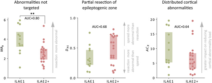
FIGURE 5.

Surgical outcome separability of each mechanism at the group level. Boxplots illustrate how well each mechanism discriminates surgical outcome groups. Each datapoint represents an individual patient. Boxes extend from the 25%–75% of the data. For each mechanism, the area under the curve (AUC) is calculated along with corresponding p‐value using a one‐tailed Mann‐Whitney U test. Good outcome patients (ILAE 1) are depicted in green, and bad outcome (ILAE 2+) in red. (**) corresponds to statistical significance at the 1% level.
