
Figure 7.
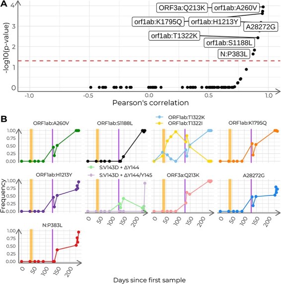
Analysis of the frequency of polymorphisms with time in the case study. (A) Pearson’s correlation coefficients and adjusted P-values for all 110 detected nucleotide variants. Dashed line indicates adjusted P = 0.05. Labeled dots represent nucleotide variants correlated with time (adjusted P < 0.05). B) Time series of relative allele frequencies. The shown positions include nucleotide variants with a significant correlation with time and sites with more than two possible states. Each subplot depicts the progression of the allele frequencies in time for a given genome position. The vertical stripes in orange indicate the span of the remdesivir clinical trial. The vertical stripes in purple indicate the days of administration of hyperimmune plasma.