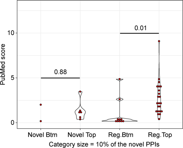
Figure 8. The PubMed score distribution of regular and novel significant PPIs reported by WIPER.
The x-axis is the categories of WIPER bottom-ranked novel edges, WIPER top-ranked novel edges, WIPER bottom-ranked regular edges, and the WIPER top-ranked regular edges. The y-axis is the PubMed score. The red dot represents the edge’s PubMed score in each category. The violin plot represents the distribution of the edge’s PubMed scores. The number across the two categories is the p-value of PubMed score t-test between the two categories.

