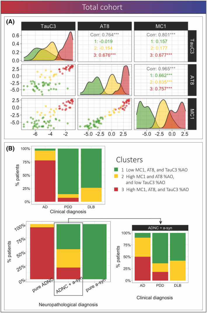
Figure 6.

Clustering analysis using pathology data in the full cohort. (A) Scatterplot matrix shows the association between pathologies and distribution of clusters for each of the variables, the colors represent the clusters, and the values show the correlation between MC1‐, AT8‐, and TauC3‐tau within the total cohort and each cluster (B) Bar plots represent the percentage of individuals from each cluster within pathological groups and percentage of individuals from each cluster within each clinical subgroup among individuals in the total cohort and within the ADNC+a‐syn group; color indicates clusters.
