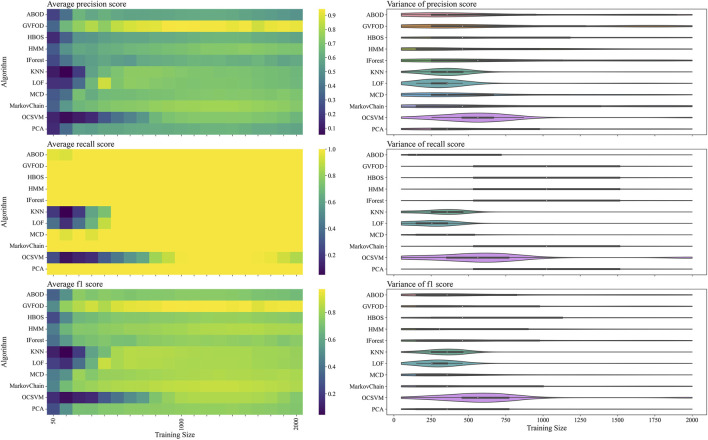
FIGURE 4.
The presented figure depicts the performance of models on tuning data, as evaluated by three distinct metrics. The three rows of the figure illustrate the average and variance of the precision score, recall score, and f1-score, respectively, across different sizes of the training data. A heat-map is used to represent the average performance, while a violin plot is employed to visualize the variance. In the violin plot, a significant deviation from the horizontal line for each algorithm indicates a high level of variance.

