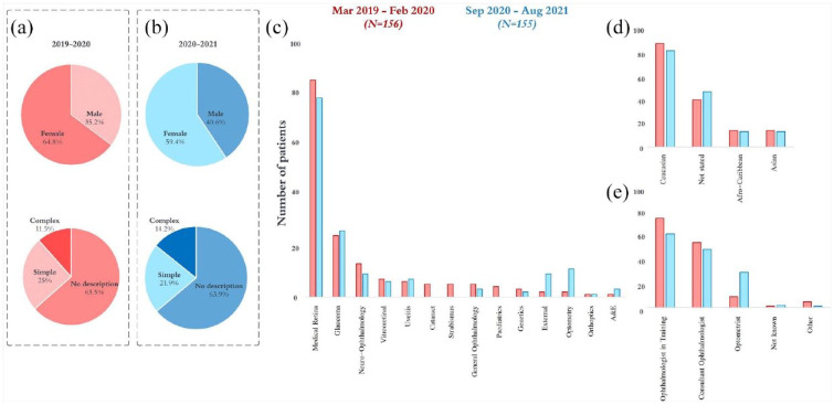
Figure 2.
Results extracted from patient records in the pre-pandemic interval are shown in red (N = 156) and the peri-pandemic interval are shown in blue (N = 155). Graphs (a) and (b) show sex distributions and descriptors of hallucinations between intervals. Graph (c) shows numbers identified based on clinical subspeciality. Graph (d) shows ethnicity. Graph (e) shows the reporting healthcare professional.

