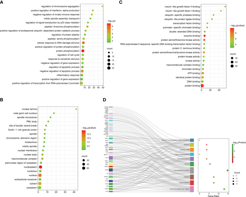
Figure 3.
Functional enrichment analysis of ARDEGs. (A) Depicted are the outcomes of GO enrichment analysis for BP, (B) CC, and (C) MF. The bubble plot illustrates the top 20 significantly enriched functions, with bubble size representing the number of DEGs (larger circles indicate more DEGs) and color representing the adjusted p-value (redder colors indicate smaller p-values). (D) KEGG enrichment analysis results are visualized in a Sankey dot pathway enrichment plot, displaying the top 10 significantly enriched pathways.

