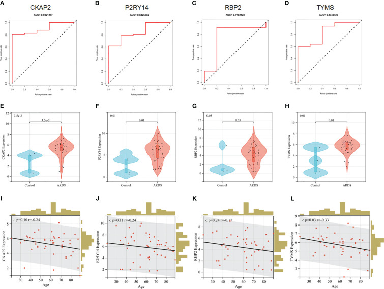
Figure 7.
Performance of hub ARDS-ARDEGs in the GSE163426 dataset. (A-D) ROC curves demonstrate the chosen genes’ diagnostic efficacy. The AUC is computed to assess the gene’s diagnostic accuracy. (E–H) Violin plots show the differences in the expression levels of particular genes between the ARDS patient group and the control group. The control and ARDS patient groups are shown on the x-axis, while the gene expression values are represented on the y-axis. The width of the violin plot represents the density of gene expression values, with a broader plot indicating a higher expression density. (I-L) Relationship between the age of ARDS patients and the expression levels of the chosen genes. The x-axis represents the age of ARDS patients, and the y-axis represents the gene expression levels. Each point on the scatter plot represents an individual ARDS patient.

