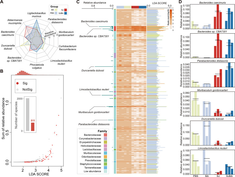
Fig 1.
Alteration in the composition of the intestinal microbiome in the S. japonicum-infected mice after treatment with B. amyloliquefaciens. (A) Changes in the relative abundance of the top 10 species by relative abundance in each of the four groups. Different colors distinguish the four groups. (B) The scatterplot shows the relationships between relative abundance and LDA scores of the species. The thresholds of the P value and LDA scores were set at 0.05 and 2.0. Red points represent species with a significant difference in relative abundance in which the P value was less than 0.05 and the LDA scores were greater than 2.0; whereas, gray points mean species did not differ in relative abundance. The red columns in the histogram represent the number of species with a significant difference in relative abundance. The orange column at the top of the plot represents the density of distribution in the LDA scores. “Sig” means significance, and “NotSig” means not significance. (C) The relative abundance and LDA scores of species with a significant difference in relative abundance. The heatmap shows the relative abundance of species with a significant difference in relative abundance. Color depth and relative abundance are proportional. The left of the plot illustrates the relative abundances of species with significant differences in relative abundances among the top 10 species by relative abundance. The right of the plot presents the LDA scores of species with a significant difference in relative abundance. Different colors of columns represent different groups. (D) The right of the plot shows the relative abundance of species with significant differences in relative abundance among the top 10 species by relative abundance in the four groups. Different colors of columns represent different groups.

