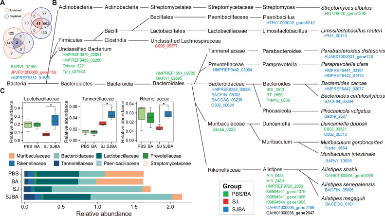
Fig 2.
The taxonomic classification levels of genes with a significant difference in abundance. (A) The Venn diagram shows the number of shared and unique OGs with the opposite trend of significant change in abundance among different groups. Orange represents that OGs were significantly enriched, and purple represents that OGs were significantly depleted. The number of OGs in this plot came from Figure S1. (B) The highest taxonomic classification levels of OGs with a significant difference in abundance. Different colors of OGs represent that OGs were enriched in different groups. (C) The relative abundance of family in the four groups. Data were analyzed by Wilcoxon test. *P < 0.05.

