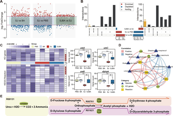
Fig 4.
The relationship between the KEGG pathway and species in the SJBA group. (A) Difference analysis of the KEGG pathway in abundance among different groups. Red points represent significant enrichment of the KEGG pathway in abundance in different groups. Blue points represent significant depletion of the KEGG pathway in abundance. Gray points represent the KEGG pathway in abundance but had no significance. Data were analyzed by the Wilcoxon test. The thresholds of P value and log2 FoldChange were set at 0.05 and 1.0. (B) The UpSet diagram shows the KEGG pathway with significant difference in abundances. Different colors of columns represent different trends of significant change. (C) Screening for KO genes and metabolic reactions with significant differences in abundance. KO genes and metabolic reactions were picked up from Figure S2. The heatmap shows the relative abundance of KO genes and metabolic reactions. The red color on the right of the plot means KO genes or metabolic reactions were significantly different in abundance in the SJBA group. Data were analyzed by the Wilcoxon test. “n.s.” means no significance. *P < 0.05. (D) The correlation network between KO genes, metabolic reactions, and species. The positive and negative correlations are separated by the colors red and blue. Triangles in blue indicate species, circles in green indicate KO genes, and squares in yellow indicate metabolic reactions. (E) Metabolic reactions involving KO genes which differed significantly in abundance. The ellipse in green represents KO genes. Different modules in different colors represent different KEGG metabolic reactions.

