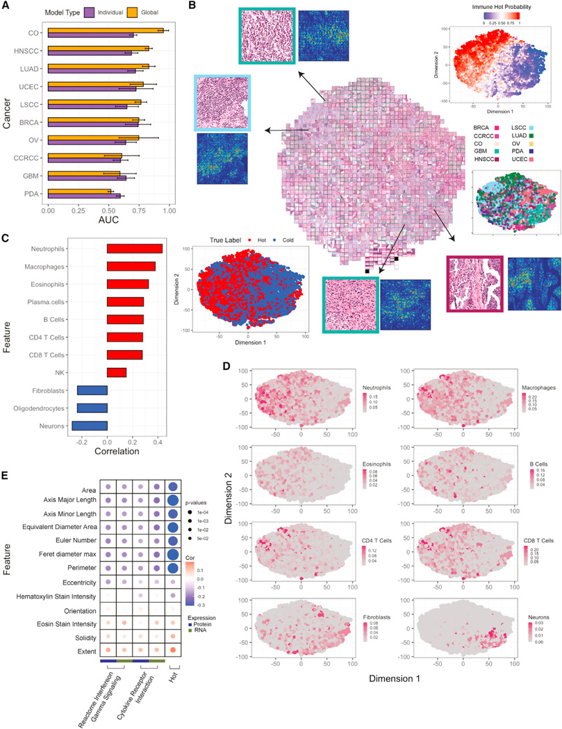
Figure 7. Histopathology assessment of immune subtypes.

(A) Bar plots showing AUCs for predicting hot versus cold tumors based on histopathology images across different cancers. For each cancer, both single-cancer and pan-cancer models are reported. Error bars correspond to standard error across 4-fold tests.
(B) Based on pan-cancer model, imaging features are extracted from the penultimate layer and separated with tSNE clustering. The top-right plot shows the separation by the model’s prediction scores, and bottom-left is color-coded by the true label. Each point represents a different tile. Tiles are bordered with their respective cancer-type color. Selected tiles are zoomed in (top-left and bottom-right) to appreciate differences with immune infiltration.
(C) Bar plot reporting Pearson’s correlation between cell type fractions and image prediction probabilities.
(D) tSNE plot color-coded with the cell type scores.
(E) Bubble plot showing Pearson’s correlation between cellular morphology and cytokine expression pathways at a pan-cancer level. The size of the bubble corresponds to p value from correlation test.
