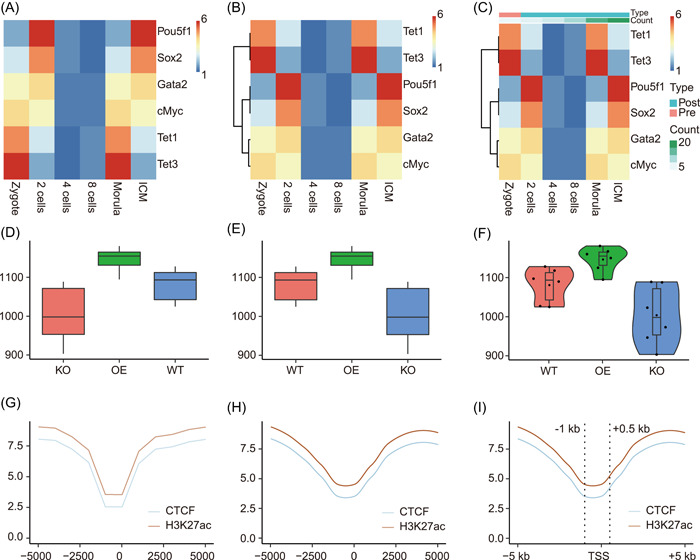
Figure 2.

Examples of ImageGP output. (A–C) Visualization output of subfunction Pretty heatmap. Each row represents one gene and each column represents one sample. Color saturation represents gene expression abundances from low to high as indicated by the color bar from blue to red. (D–F) Visualization output of subfunction boxplot. Boxplot showing alpha diversity of three sample groups. Each point represents the alpha diversity index for each sample. (G–I) Visualization output of subfunction Line plot. Line plots showing the meta‐gene profile of CTCF (CCCTC binding factor) binding and H3K27ac in the flanking 5 kb of transcription start sites (TSS)
