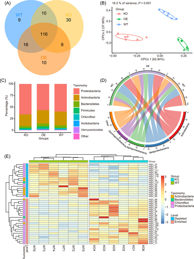
Figure 3.

Supplementary examples of publication‐quality visualizations to Figure 2. (A) Venn diagram showing common and unique ASVs (relative abundance >0.1%) among three groups. (B) Constrained principal coordinate analysis (CPCoA) of three groups. (C) Stacked plot of average relative abundance at phylum level of three groups. (D) Circle plot of average relative abundance at phylum level of three groups. (E) Heatmap showing significantly different ASVs between KO and WT groups (Wilcoxon test, p < 0.05). ASVs, amplicon sequence variants; KO, knock‐out; WT, wild‐type.
