
Figure 3.
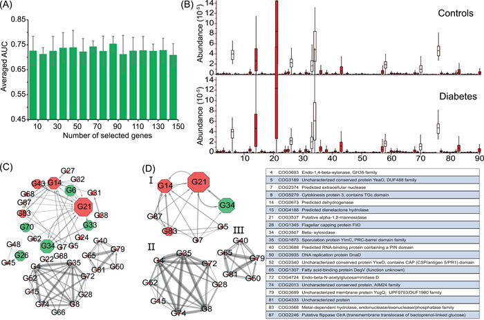
Marker gene identification and interaction network construction. (A) Averaged area under the curve (AUC) of classification with the different number of the ranked genes based on Neural Network‐based classifier by using fivefold cross‐validation on the gene profile of D1. And the peak value could be obtained as the 90 species were selected, thus these genes were identified as the marker genes in this study. (B) The distribution of the abundance of the marker genes significantly varied across samples in diabetes‐related dysbiosis. A comparison between the cases (n = 183) and controls (n = 185) from the gene profile of D1. Using Kruskal–Wallis test, the species with red color were identified that the abundances varied significantly (p < 0.05) across all samples. The order of the marker genes is the same as that in Table S6. (C) The interaction network of marker genes was determined by GENIE3, where the top 100 most reliable interactions between marker genes were selected. The width of the edges between nodes is proportional to the reliability of the linkage between the nodes. The size of each node is proportional to the averaged abundance of the marker genes. The network layout was calculated by the Cytoscape software using a circular layout. The number in each node is the ID of the marker species, which is consistent with Table S3. The nodes with red color are the marker species that significantly enriched in the diabetic samples or the control samples. (D) Interactions between marker genes with a degree of more than five