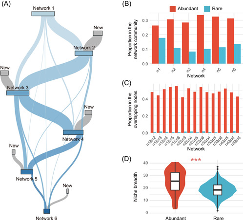
Figure 4.

Turnover in network communities from freshwater to seawater. (A) Sankey plot shows that most nodes of the network community were replaced during the transition from freshwater to seawater. (B) Proportions of abundant and rare taxa in each network community. (C) Proportions of abundant and rare taxa in the overlapping nodes between network communities. (D) Comparison of the ecological niche breadths of abundant and rare taxa (***p < 0.001; Wilcoxon rank‐sum test).
