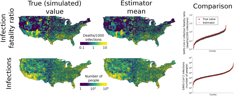
Fig. 2.
Performance of county-level estimators. Maps in the first column show true (simulated) SARS-CoV-2 IFRs and numbers of infections. All values were conditioned on observed numbers of COVID-19 deaths. Counties with zero COVID-19 deaths are omitted from the SARS-CoV-2 IFR estimation results because they have ratios of zero. The second column gives the means of the estimates over 100 simulated data sets for each county. The close match between true values and estimates indicates that the estimators have high accuracy. The accuracy is further illustrated by the graphs in the third column, which plot the true values in each county compared to the mean of the estimator. In each plot, counties (x-axis) are ordered by increasing value.

