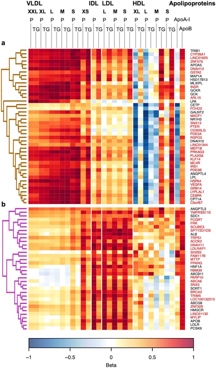
Extended Data Fig. 5. A zoomed heat map of lipoprotein and lipid associations.

The full heat map including all the loci and a full set of lipoprotein traits is shown in Extended Data Fig. 4. For clarity, two of the clusters are highlighted here. For details, see legend for Extended Data Fig. 4. Panels a and b corresponding to the brown and purple branches of the dendrogram shown in the full-sized heat map, respectively. Effect sizes were scaled relative to the absolute maximum effect size (beta) in each locus. In the heat map, each row represents a single SNP, each column corresponds to a single metabolic measure, and the effect estimates for the SNP-metabolite associations are visualized with a colour range. Loci highlighted in red were not identified in the previous NMR metabolomics GWAS.
