Figure 1:
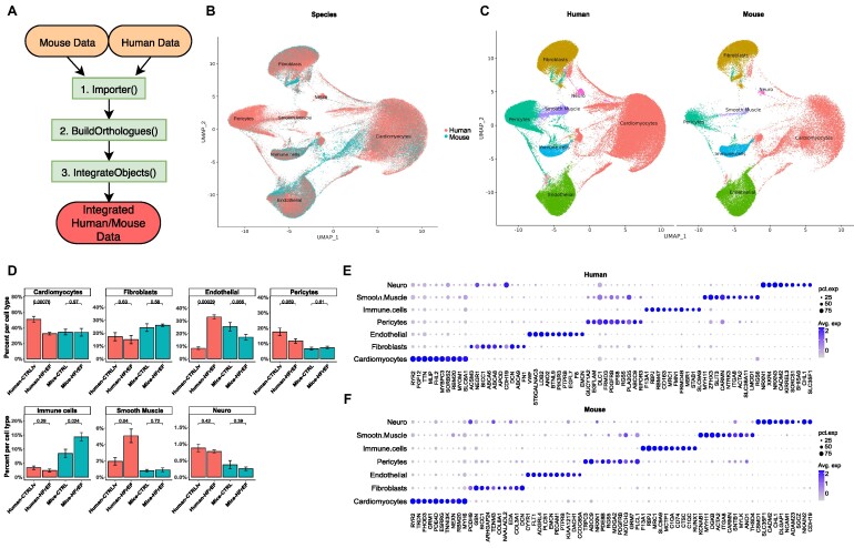
Integrated human and mouse snRNA-seq data of healthy and heart failure samples. (A) Use case diagram of OrthoIntegrate: shown are the steps that are run by the user within their standard Seurat workflow. First, the Import function is used to create Seurat objects from scRNA-seq data; second, orthologs are searched by the BuildOrtholog function, and the third step creates an integrated object with uniform nomenclature by using the IntegrateObjects. (B) UMAP showing human cells (red) and mice cells (blue) in a common UMAP projection. In addition, cell types for the cell clusters can be seen. (C) UMAP with defined clusters according to Seurat’s clustering, divided by species. Cells of mouse and human origin commingled in all clusters. There are no clusters formed that originated from only 1 of the 2 species. The cells were identified as cardiomyocytes (red), fibroblasts (yellow), endothelial cells (green), pericytes (turquoise), immune cells (blue), smooth muscle cells (purple), and neuronal cells (pink). (D) Bar plot showing cell composition of cell types in human (red) and mice (blue) samples. Samples were grouped based on their origin into human controls from the left ventricle (Human-CTRLlv), human HFrEF (Human-HFrEF), mouse controls (Mice-CTRL), and mouse HFrEF model (Mice-HFrEF). Cell types were then analyzed for their composition from the previously mentioned groups and plotted. P values above the certain groups were calculated by 2-sided Student’s t-test. (E) Dot plot depicting the average expression levels and expression proportions in human samples of the top 10 feature genes for the found cell types. The size of the dot represents the proportion of cells expressing the indicated gene within a cell type, and the color indicates the average expression level of cells. (F) Dot plot depicting the average expression levels and expression proportions in mice samples of the top 10 feature genes for the found cell types. Similar to (E), the size of the dot represents the proportion of cells expressing the indicated gene within a cell type, and the color indicates the average expression level of cells.

