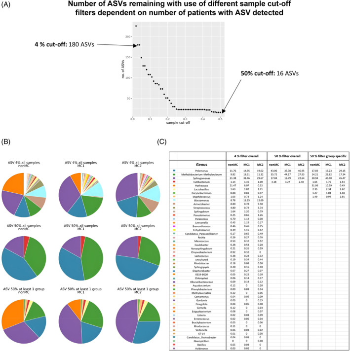
FIGURE 3.

Comparison of different filter cut‐offs. (A) The graph shows the number of ASVs left when the prevalence filter cut‐off is set at different percentages. (B) Genera distribution based on the median abundance per genera with three different filters: genera detected in more than 4% of patients overall (top row), genera detected in more than 50% of patients in at least one group (middle row) and genera detected in overall more than 50% of patients (bottom row). (C) The table depicts the information from the pie charts in percentages based on the median abundance per genus. ASV, amplicon sequencing variant.
