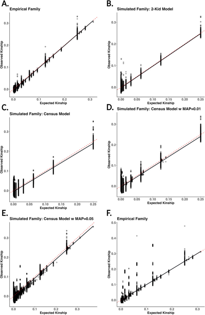
Figure 6:

Scatter plots of estimated vs expected kinship across six different pedigree structures. The solid black line is a regression between estimated and expected kinship. The six different pedigrees generated represent A) empirical pedigree from Familinx not including implicit founders, B) simulated family using a 2-kid model, C) simulated family using census data for sibship distributions, D-E) census simulated family with simulated misattributed paternity (MAP = 0.01, 0.05), and F) empirical family from Familinx with implicit founders included. The red dashed line represents the expected kinship across each relationship.
