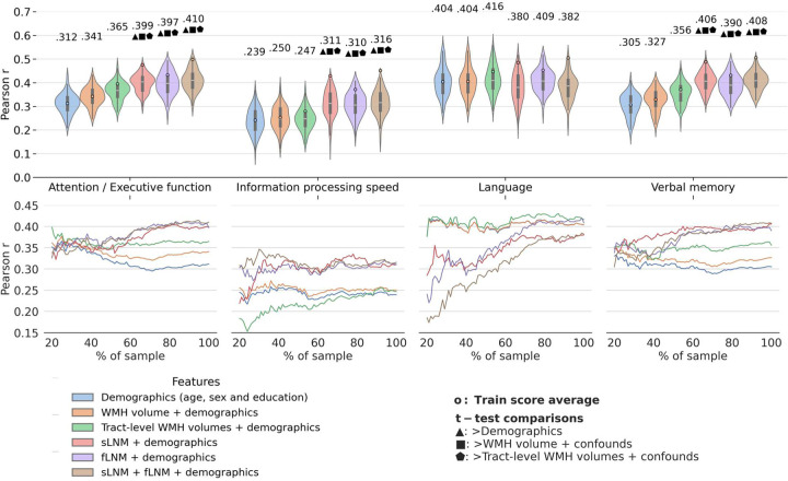
Figure 2. Predictive modelling analysis.
Violin plots illustrate prediction outcomes across cognitive domains. Each violin displays the distribution of Pearson correlations (between actual and predicted cognitive domain performance; 10-fold cross-validation × 10 repeats = 100 folds → 100 Pearson correlations) for a model informed by a different feature set. The higher the Pearson correlation, the higher the prediction performance. blue: demographics (age, sex and education); orange: total WMH volume + demographics; green: tract-level WMH volumes + demographics; red: sLNM scores + demographics; purple: fLNM scores + demographics; brown: sLNM scores + fLNM scores + demographics. Average Pearson correlations are indicated above each violin, with colored dots showing training score averages. Geometric symbols denote t-test results comparing LNM-based models against demographics- and WMH volume-based models: ▲ indicates higher Pearson correlation than demographics, ■ than WMH volume + demographics, ⬟ than tract-level WMH volume + demographics. Below the violin plots, performance curves display the average Pearson correlations across folds, for subsets randomly sampled in sizes ranging from 20% to 100% of the entire dataset. Line colors match the corresponding violin plots in panel a) which display predictive modelling results for the full sample size. Again, higher Pearson correlation indicates higher prediction performance. Abbreviations: fLNM = functional lesion network mapping, sLNM = structural lesion network mapping, WMH = white matter hyperintensities of presumed vascular origin.

