. 2024 Jan 31;67(2):455–476. doi: 10.1044/2023_JSLHR-23-00280

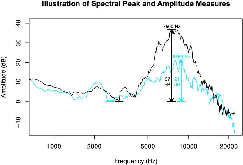
Figure 4.

A graph of the amplitude in decibels on the y axis and the frequency in hertz on the x axis. The y axis ranges from negative 10 to 40 in increments of 10. The x axis ranges from 1000 to 20000. The title of the graph is Illustration of spectral peak and amplitude measures. Black and blue fluctuating curves are plotted. The black curve starts at (1000, 8), goes down to a horizontal level near (3000, 0), goes up and reaches a peak of (7500, 37), drops down to (20000, negative 5) and ends. The blue curve starts at (1000, 5), goes down to a horizontal level near (3000, 0), goes up and reaches a peak of (8850, 21), goes down to (20000, negative 10) and ends.

Spectral peak and amplitude difference measurements for a token of /s/ before /i/ in the word “see,” produced by a female control speaker (in black) and produced by a female Class III patient (in blue). The spectral peaks and troughs are indicated by horizontal line segments. The amplitude difference of each main spectral peak (relative to the lower spectral trough) is indicated by the height of the arrow. The peak's frequency is indicated by the arrow's horizontal position.