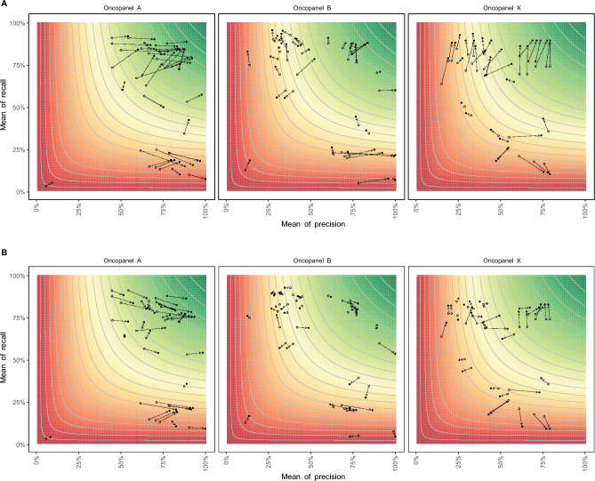
Figure 5.
Performance comparison among different genomic regions. The x-axis is the mean of precision for each pipeline, and the y-axis is the mean of recall for each pipeline. The open dots represent the measurements of evaluation regions, while the solid dots represent the measurements of (A) HCI regions, or (B) coding regions. The contour lines and color represent the mean of F1-score for each pipeline, where the color gradient from green to red is proportionate to the mean F1-score from high to low.

