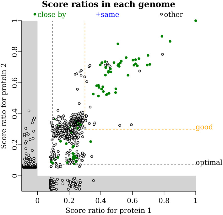
Fig 4. The presence/absence plot.
Each point is a genome that contains a homolog of protein 1 and/or protein 2. Each axis shows the score ratio (the bit score divided by the maximum) for the highest-scoring homolog in that genome. Genomes are highlighted in green if the two homologs are encoded close by. If the same protein in a genome is the highest-scoring homolog for both queries (such as a fusion protein), then the genome would be highlighted in blue. Other genomes (with the homologs not encoded nearby) are shown in black. If a genome contains a homolog for one query but not the other, then the score is shown in the gray region below zero. Hovering on a point shows the taxonomic lineage of that genome. The two query proteins are ING2E5A_RS06865 and ING2E5A_RS06860.

