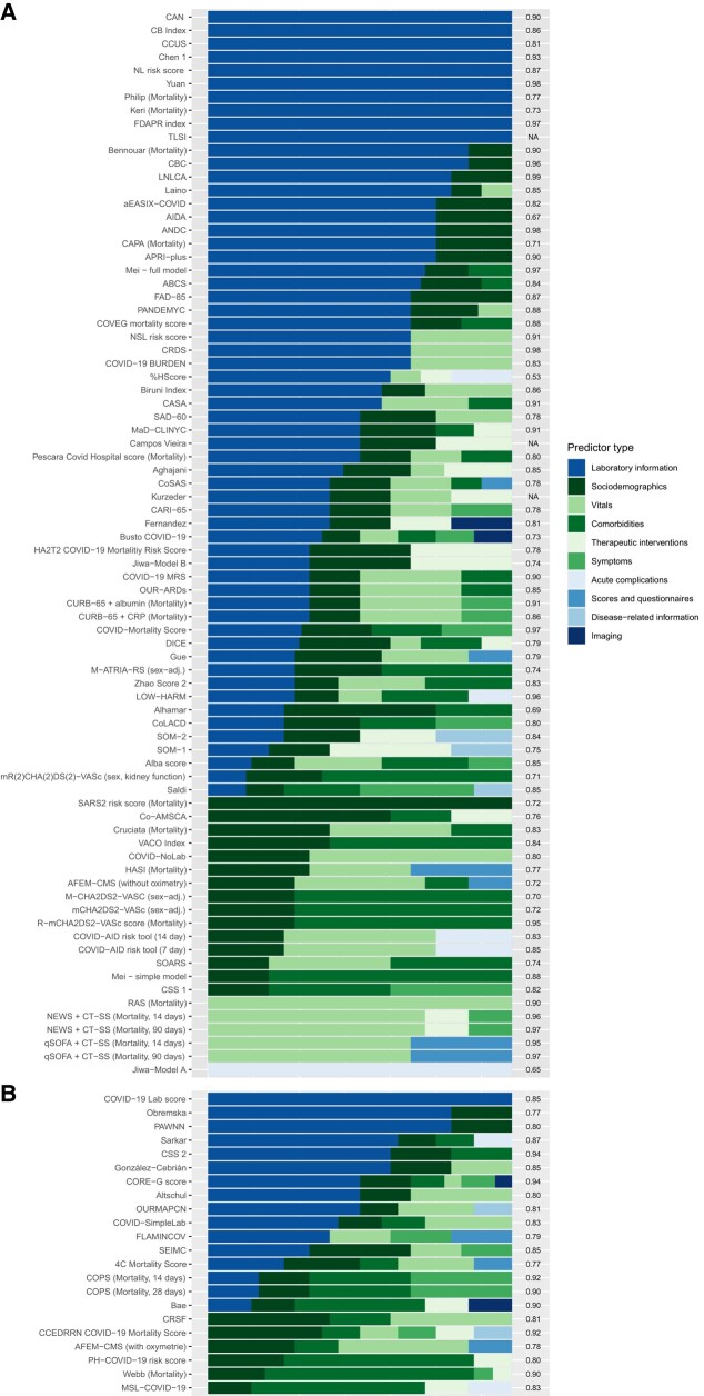
Figure 3.
Predictor composition aggregated by predictor type for all scores assigned to category 1 stratified by the level of selection. A, Level 1, B, Level 2. The AUC is displayed on the right y-axis. The sorting of the scores is determined by (I) the absolute number of categories and (II) the relative proportion across all scores. The color gradient from green to blue indicates the availability of the category, although in case of doubt, this also depends on the level of care. Similar presentations of scores assigned to categories 2–4 are displayed in the Supplementary Material. Abbreviations: AUC, area under the curve; COVID-19, coronavirus disease 2019.

