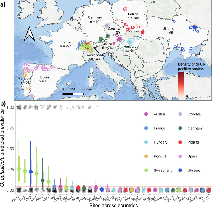
Fig. 1. Spatial distribution of snake captures and detections of O. ophidiicola across Europe.
a Each circle represents an individual snake capture and overlapping points were jittered for visualization. Different colors are used to distinguish countries, filled points indicate snakes that were qPCR positive (n = 109), and outlined points are qPCR negative snakes (n = 1145). Underlying density heatmap shows spatial distribution of O. ophidiicola infection risk based on qPCR positive detections using a kernel density estimation algorithm. We used a 100-km radius around each positive point and the scale bar indicates point density (i.e. relative disease risk) across each region. b Estimated O. ophidiicola prevalence across sites (n = 33) sampled in 10 countries. Each transparent black circle represents a single snake as being either negative (0) or positive (1). Larger circles and whiskers show the model predicted posterior mean ± standard deviation (thick lines), and 95% credible intervals (thin lines). Color of the circles represent the different countries; red line shows threshold for elevated prevalence defined as the estimated mean prevalence across all sites.

