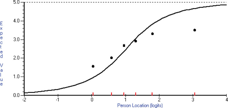
Fig. 2.
The fit of item 20 to the Rasch model is shown. The curve represents the expected value for a person’s location (severity/empowerment estimate) according to the model. The dots represent the observed class interval means. There are six class intervals here of approximate equal sample size (the short vertical lines on the x axis). Their mean score for this item is shown on the y axis (observed value). In this sample, the highest-class interval (most empowered) has a lower mean score (response category chosen) than expected by the model. The opposite is true of the lowest class interval.

