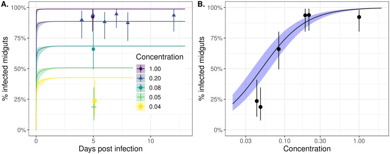
Fig 2. Midgut infection occurs rapidly following an infectious blood meal and the likelihood of successful infection is strongly dose-dependent.
Panel A shows the proportion of positive midguts as a function of days post-infected blood meal (DPI) for a range of infectious blood meal doses (coloured lines) relative to our highest “base” dose (concentration = 1; purple line). The points represent the experimental data, and the solid lines correspond to model simulations. Panel B shows the proportion of positive midguts on day 5 post-infectious blood meal as a function of infected blood meal dose relative to the base. Both plots show results only for the dichotomous feeding experiments. The points and whiskers indicate the experimental data, and the line and shaded ribbons represent the model simulation. The solid points indicate the posterior median proportions, and the whiskers indicate the 2.5%-97.5% posterior quantiles, assuming a uniform prior on the proportion. The lines represent the posterior median simulation and the ribbon represents the 2.5%-97.5% posterior quantiles in the median. In both plots, the modelled % infected midguts values were determined by calculating the probability the titer exceeds the detection threshold, specified by Eq (8).

