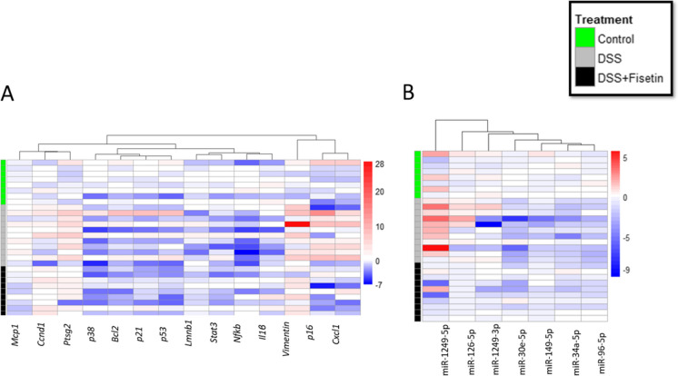
Fig. 6.
Heat map showing the fold changes in each sample using − ∆∆Ct, normalized based on average of control samples. Blue indicates downregulation, and red indicates upregulation. Groups are separated along the y-axis, with control samples marked in green (n = 8), DSS in grey (n = 11), and DSS + Fisetin in black (n = 9)

