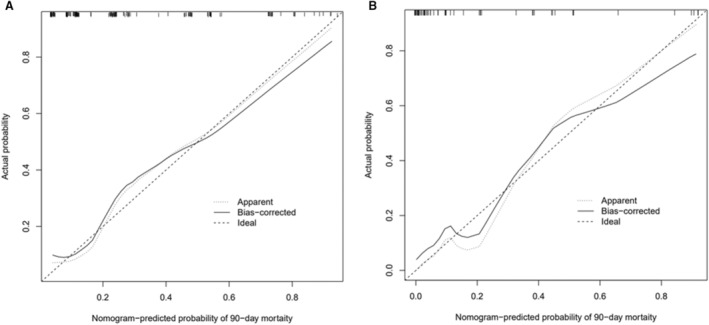
Figure 3. Assessment of the nomogram model with the calibration curve.

The calibration curves of the nomogram model in the training cohort (A) and the validation cohort (B). The x axis represents the predicted risk of mortality. The y axis represents the actual probability of mortality. The diagonal dashed line represents the perfect prediction of the ideal model. The solid line represents the performance of the nomogram model, where closer to the diagonal dashed line represents better prediction.
