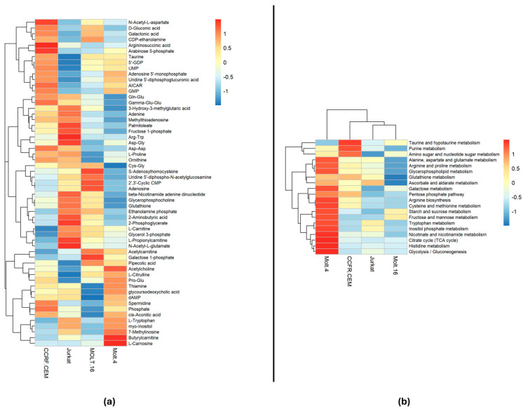
Figure 2.
The heatmaps: (a) Displays the correlation of the 57 statistically significant polar metabolites within each cell line. The colors indicate the expression level of each individual metabolite in each cell line based on their relative abundance. (b) Presents the results of pathway analysis conducted on each cell line sample, comparing them to medium bootstrap samples. The colors represent the significance based on the −log(p-value) of each pathway in each cell line. The analysis employed the Euclidean correlation index and the complete clustering method.

