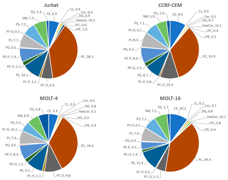
Figure 4.
Pie chart: the figure shows the percentages of lipid classes referred to each cell line. Excel-Microsoft office 365 (version 2402) was used to create the charts after obtaining the percentages table by using an R script on the lipid data matrix. Every color represents one of the lipid classes.

