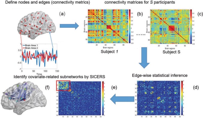
Fig. 1.
The SICERS pipeline: (a) define brain regions as nodes and connectivity metrics between each pair of nodes as edges; (b) and (c) calculate the connectivity matrix for each single subject in a study, where each off-diagonal element in the matrix represents the connectivity strength between two nodes, then identify differential connectivity patterns between clinical groups; (d) plot the edge-wise statistical inference, where each off-diagonal element is a negatively logarithmically transformed  -value (e.g., two-sample-test
  -value per edge between clinical groups and a hotter point in the heatmap suggests larger group-wise difference); (e) reveal the disease-related subnetwork detected by SICERS; (f) show the corresponding 3D (3D) brain image. Note that (e) was obtained by reordering the nodes in (d) by listing the detected subnetwork first (i.e., these two graphs are isomorphic).

