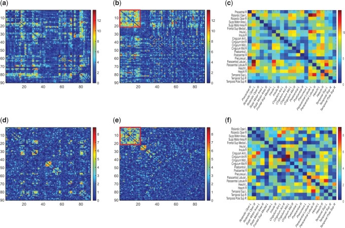
Fig. 3.
Applying SICERS to clinical data  (a)–(c) and replication data
  (d)–(f). (a) A heatmap of
  of the first data set (
 ); hotter pixels indicate more differential edges between cases and controls, and there is no apparent topological pattern for these hot edges. (b) We then perform SICERS in
  and find a significant subnetwork [the bold square, which is magnified in (c)]. (c) The enlarged disease-relevant subnetwork in
  with region names. (d) A heatmap of
  of the second data set (
 ). (e) The disease-relevant subnetwork was detected by using
  alone. (f) The enlarged network in
  with region names. To save space here, versions of the enlarged plots (c) and (f) with more-readable axis labels are included in the supplementary material available at Biostatistics online.

